guide
One look across many screens
Answer in brief
To keep several screens in one look, write the shared values down once as tokens and give that same block to every prompt. Do not let a single UI piece set the look of a whole app. A toggle or a widget shows one surface and a few states, and a whole product needs decisions that piece never made.
Why screens drift apart
Each prompt is answered on its own. Ask for a dashboard on Monday and a settings screen on Tuesday, and the tool chooses a type scale, a radius and a grey twice. The two answers are close but not equal, and close is what makes an app look assembled from parts.
Working in one project helps, because a coding agent can read the files it wrote earlier. It still helps to make the shared values explicit, so that nothing depends on the tool noticing them.
Why one piece is not enough
A single striking component is tempting as a starting point: a liquid button, a glass card. Stretching it over an app goes wrong in two ways. The piece has no answer for things it never contained, such as a table, a form error or a long paragraph, so the tool invents them and they do not match. And an effect made for one moment becomes tiring when every surface has it.
A family of pieces is a sounder base. A dashboard, a widget set and a menu that already share a type scale, a spacing step and a way of using light give you answers for dense and sparse layouts, for data and for controls. Take the look from the family and use the showpiece once, where it earns its place.
Write the tokens first
- Collect the values from the first screen you are happy with: colours, type scale, spacing step, radii, shadows or borders, durations and curves.
- Name them by job, not by value: surface, surface-raised, text, text-secondary, accent, radius-panel, radius-control, duration-fast.
- Put them in one file, as CSS custom properties, and tell the tool that file is the only place values live.
- List the components that exist: button, input, panel, row, tab. New screens are built from these before anything new is made.
- Paste the same block at the top of every later prompt, or point the agent to the file, and say that a value not in the list needs your approval.
Prompt screen by screen
With the tokens in place, a screen prompt gets shorter. It no longer describes the look. It describes the content, the layout and the states, and says "use the tokens and components in this project". Ask the tool to report anything it had to add. That report is how you find the gaps in the system while they are small.
After each screen, look at two screens side by side. Check the things that drift first: the size of headings, the padding inside panels, the height of rows and buttons, and the grey used for secondary text.
Where a library helps
Designing a family from nothing is slow. In our library, UI templates are single pieces, and each one states its type, spacing, colours and motion in its prompt. If you start from one, treat it as one piece: pull its values into your token file, then check them against a second and third kind of screen before the whole app depends on them.
A token block to share between prompts
This project has one design system. Use only these values. If a screen needs one that is missing, stop and ask before adding it.

Put them in src/tokens.css as custom properties, and read them from there:

--surface: [#hex];            page background
--surface-raised: [#hex];     panels, cards, menus
--line: [#hex];               1px borders and dividers
--text: [#hex];
--text-secondary: [#hex];
--accent: [#hex];             primary action and active item only
--positive: [#hex]; --negative: [#hex];

--font: [typeface], system-ui, sans-serif;
--size-title: 28px; --size-heading: 18px; --size-body: 15px; --size-label: 12px;
--weight-regular: 400; --weight-strong: 600;

--space-1: 4px; --space-2: 8px; --space-3: 12px; --space-4: 16px; --space-5: 24px; --space-6: 32px;
--radius-panel: 16px; --radius-control: 10px;
--row: 44px;                  rows, inputs and medium buttons share this height

--duration-fast: 0.12s; --duration-base: 0.22s;
--ease: cubic-bezier(0.2, 0.8, 0.2, 1);

Components that already exist in src/components: Button, Input, Panel, Row, Tabs, Menu. Build new screens from these. Do not restyle them inside a screen.

Now build the screen "[name]": [content, layout and states]. When you finish, list any value or component you had to add, and compare this screen's headings, panel padding and row heights with [another screen].
Written for this page as a starting point; swap the parts in [brackets] for your own. The full prompt of each uberdesigner template is longer and specific to one finished design, and it is tested by rebuilding the template from the prompt alone.
Pieces that read as one family
-
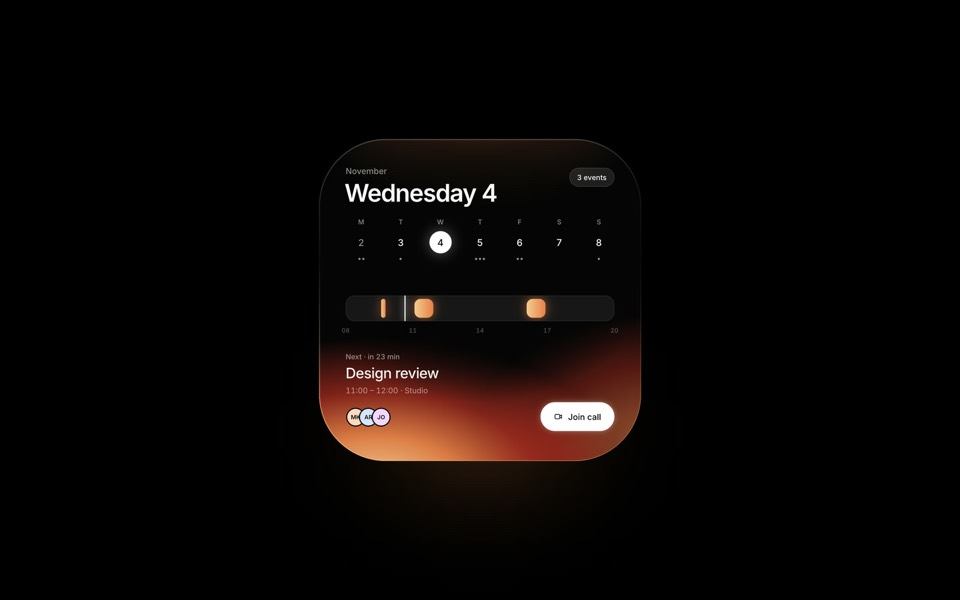
day calendar
A dark calendar widget lit from inside: the light follows the selected day, from Wednesday's ember to Friday's cobalt.
see it on uberdesigner -
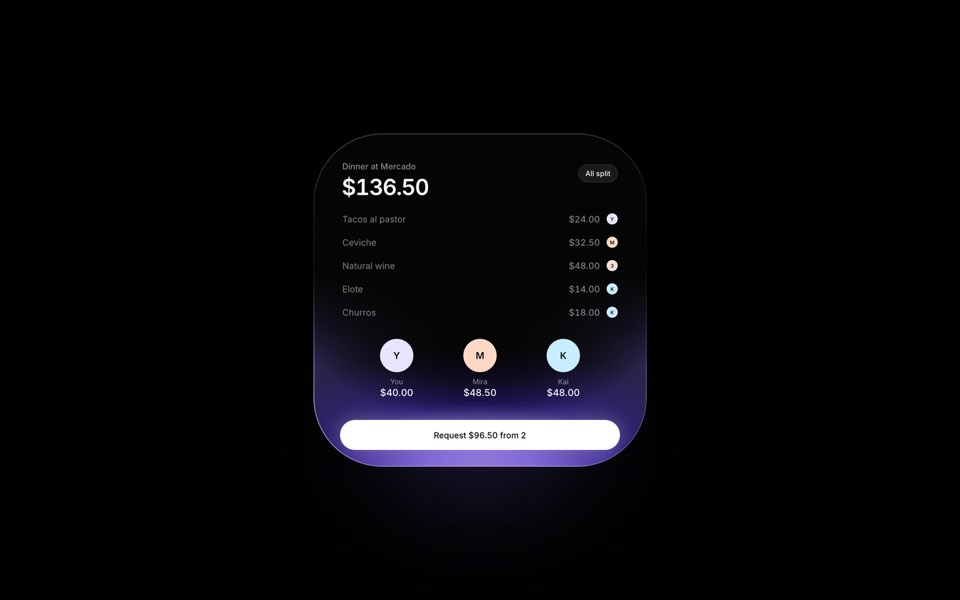
split bill
A dinner bill split in motion: items fly from the receipt to the people who had them, inside a dark widget lit in iris violet.
see it on uberdesigner -
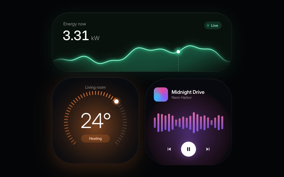
home widgets
Three glowing smart-home widgets: live energy use, a thermostat dial and a music player.
copy its prompt on uberdesigner -
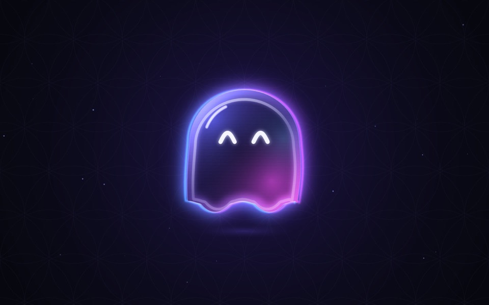
ghost buddy
A glowing glass ghost that follows your cursor and morphs its eyes into every mood.
copy its prompt on uberdesigner
Questions and answers
Is a token block the same as a design system?
It is the smallest useful part of one. A full design system also documents components, patterns and rules for use. For a handful of screens built with an AI tool, tokens plus a short list of components cover most of the drift.
Can I mix pieces from different styles?
You can take ideas from several, but one style has to win. Choose the family whose type, spacing and surfaces you keep, then rebuild anything borrowed from elsewhere with those values.
Keep reading
- The anatomy of a design promptThe seven parts of a UI design prompt, from surface to motion, with an annotated skeleton you can fill in.
- How to describe a visual style to an AI toolThe vocabulary a model acts on when building UI (materials, light, density, edges) and the adjectives it ignores, with a style block to copy.
- Design prompts for code tools vs image generatorsA design prompt means two different things: a brief for a tool that writes a working interface, or a description for a tool that makes a picture. What each is for.
Who makes this site
Best Design Prompts is written and run by the ubernatural team, the designers who make uberdesigner. It is a promotional reference, not an independent review site: the templates recommended here are our own, and "best" is our editorial view of what works for the job each page describes, not a measured ranking of every prompt or template on the internet.
Cite this page: Best Design Prompts, “One look across many screens”. Reviewed 11 November 2026. https://bestdesignprompts.com/guides/one-look-across-many-screens/