prompt topic
Button and control prompts
Answer in brief
A button or control prompt works when it lists every state and gives each one a look: rest, hover, pressed, focused, disabled, loading and done. A control is a few dozen pixels, so the whole design is in how it changes.
Give its measurements too. Height, horizontal padding, radius, label size and weight take one line and stop the model from choosing a different size each time you ask.
Measure the control
A button is a height, a padding, a radius, a label and sometimes an icon. A toggle is a track and a knob with a travel distance. A slider is a track, a fill, a knob and a value. Write the parts and their sizes. For a toggle, that could be a 52 × 32px track, a 26px knob and 3px of inset.
State the sizes you need as a short set, for example 32, 40 and 48px high, so the control can sit in a dense table and on a roomy form.
Write the states as a table
For each state give the fill, the border, the label colour, any shadow and the transform. Hover might lighten the fill by a step. Pressed might move the control down 1px and drop its shadow. Focus needs a visible ring that does not rely on colour alone: a 2px ring with a 2px offset is a dependable choice.
Loading and success are states as well. Say whether the label is replaced by a spinner, whether the width is held so the layout does not jump, and how long the success state stays before the button returns to rest.
Time the change and wire the keyboard
Controls should answer fast. Give durations: around 0.12s for press, 0.2s for hover and for a toggle's knob. Name the easing. If you want a physical feel, describe it as a spring with a small overshoot, in pixels, and say where it applies.
Then the keyboard: Space and Enter on a button, arrow keys on a slider and on tabs, and the right role so assistive technology announces it. A tool that is asked for this does it well. One that is not asked often skips it.
What a button or control prompt should contain
- The anatomy: each part with its size, padding and radius.
- The sizes the control comes in.
- Every state: rest, hover, pressed, focus, disabled, loading, done.
- Timing: duration and easing for each change.
- Keyboard and roles: keys, focus ring, accessible name.
- The stage: a plain page showing all variants side by side, and touch behaviour.
A prompt to start from
Build a small control set for [product]: one button component and one toggle switch, shown on a single page with every variant and state visible.

Stack: Vite + React + TypeScript, plain CSS with custom properties. No libraries.

Page: background #f4f2ee, a centred 720px column, sections labelled in 12px uppercase #8a867e.

Button:
- Sizes: 32, 40 and 48px high, with 12, 16 and 20px horizontal padding and 13, 14 and 16px labels at weight 600. Radius 10px.
- Variants: primary (fill [#hex], white label), secondary (fill #ffffff, 1px border #d8d4cb, label #1b1a18), quiet (no fill, label #1b1a18).
- States: hover lightens the primary fill by 6% and tints the others #ece9e2; pressed moves the button down 1px and scales it to 0.98 over 0.12s; focus-visible shows a 2px ring in the accent with a 2px offset; disabled is 40% opacity with no pointer events.
- Loading: the label is replaced by a 16px spinner, the width is held. After 1.4s it becomes a check for 1.2s, then returns to rest. Trigger it on click of the button labelled "[Save changes]".

Toggle:
- Track 52 × 32px, radius 16px, off #d5d1c8, on [#hex]. Knob 26px, white, 3px inset, shadow 0 1px 3px rgba(0,0,0,0.25).
- The knob travels 20px in 0.22s with cubic-bezier(0.3, 1.4, 0.5, 1) so it overshoots slightly. While pressed, the knob widens to 30px.
- role="switch", aria-checked, Space toggles it, the same focus ring as the button.

Show a grid of every button size, variant and state, forced with a data attribute so they can be seen without hovering, and four toggles: off, on, focused, disabled.

Touch: no hover styles on touch devices; targets are at least 44px including padding. With prefers-reduced-motion, state changes are instant and the spinner is replaced by the text "Saving".

Run it and tab through every control with the keyboard at 390px and 1280px.
Written for this page as a starting point; swap the parts in [brackets] for your own. The full prompt of each uberdesigner template is longer and specific to one finished design, and it is tested by rebuilding the template from the prompt alone.
What this prompt built
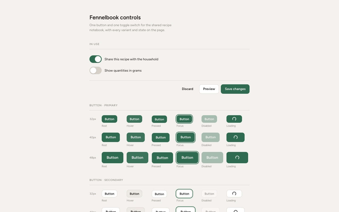
We ran the prompt above once in Claude Code, with the brackets filled in for an invented brand, Fennelbook. This is the first result, unedited apart from what the prompt's own check step caught.
- Filled in
- Product: Fennelbook, an invented shared recipe notebook; primary fill and toggle 'on' colour #2f6b4f; the loading button is labelled Save changes; Figtree was picked as the typeface because the prompt names none.
- Where it falls short
- The forced Focus samples look exactly like real keyboard focus, so tabbing through the 53-stop grid is confusing; the 6% lighter hover is hard to see on a dark green; and the screenshot shows only the top of a page about 1,500px tall.
Buttons and controls to start from
Finished controls on uberdesigner: button sets, toggles, a slider and a tab bar, each with its own material and motion. Five of these are free.
-
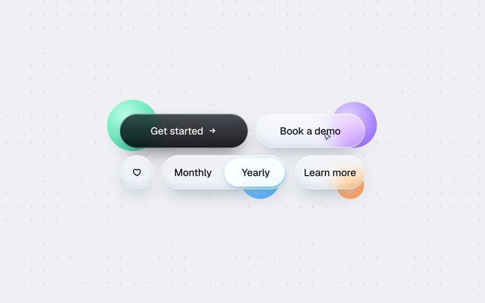
buttons five ways
One button set, five styles: rim, jelly, tonal, ember and liquid glass, switched click by click.
copy its prompt on uberdesigner -
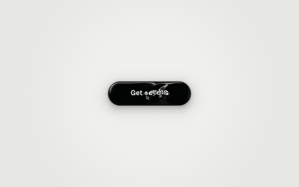
ferrofluid button
A Get access button made of glossy black liquid: hover raises a bulge and a wake of ripples that bend the label, and a click sends three waves across it as You're in surfaces.
copy its prompt on uberdesigner -
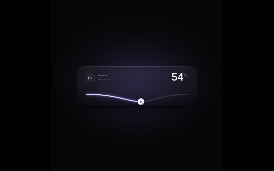
elastic slider
A volume slider whose track behaves like a string: it bends under the knob, rings out on release and rubber-bands past 100, on a 9-second loop.
see it on uberdesigner -
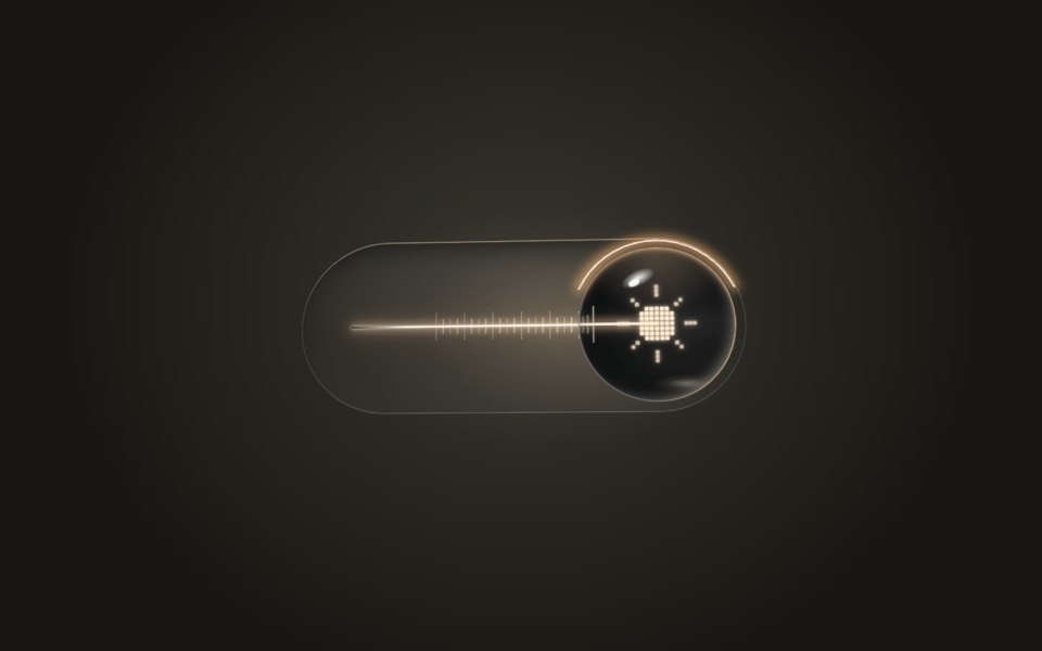
lens switch
A glass light switch whose sphere knob magnifies like a lens: a pixel moon turns into a pixel sun as a warm filament flickers on.
copy its prompt on uberdesigner -
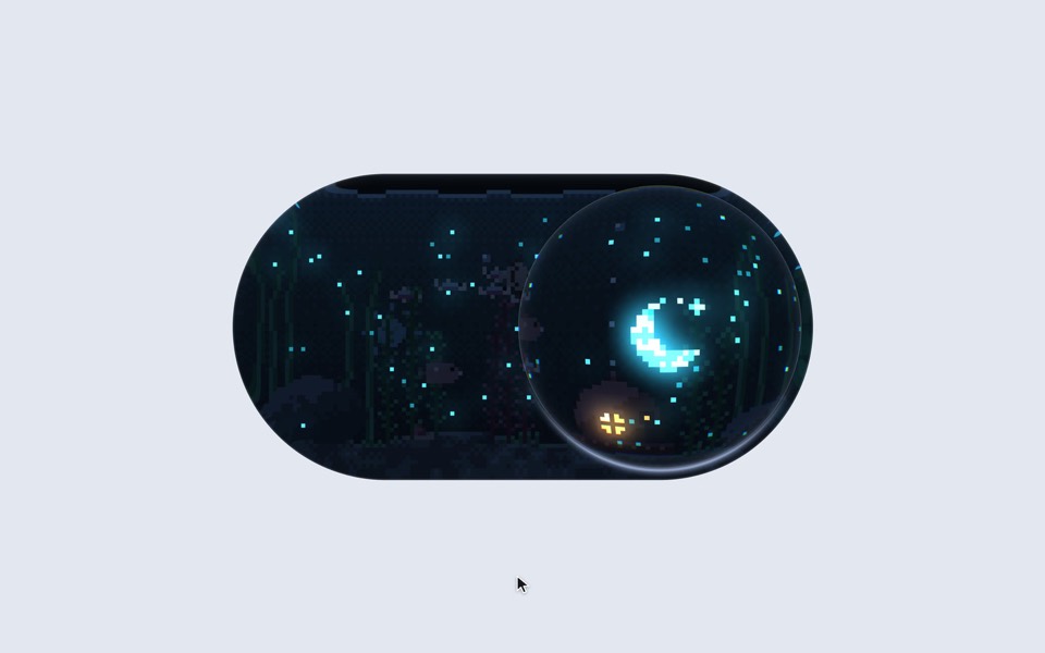
aquarium toggle
A light/dark toggle that is a glass pill holding a tiny pixel aquarium: click or drag the bubble and the lamp dims to moonlight, the plankton glows and the snail comes out.
copy its prompt on uberdesigner -
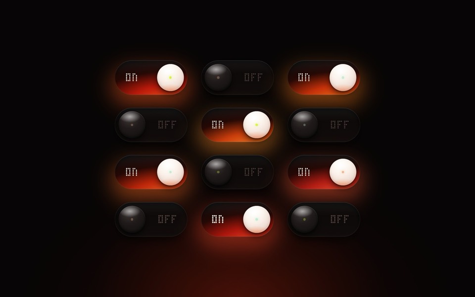
pilot light
Twelve glass toggle switches with warm glows, flipping on and off in a six-second loop.
see it on uberdesigner -
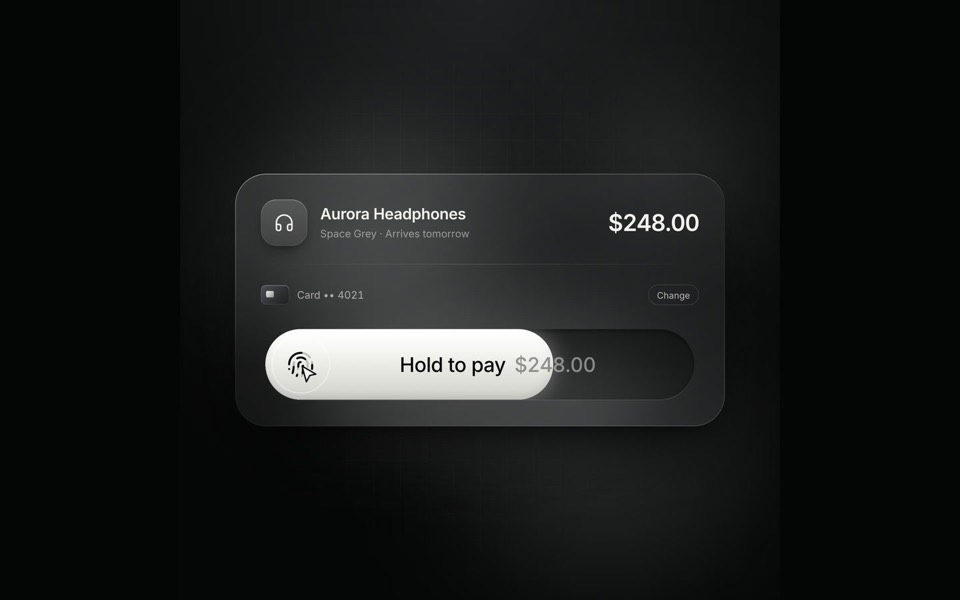
hold to pay
A glass checkout card on an 8.4-second loop: hold the pay button and the fill sweeps across, the button collapses into a spinner and springs back out as Paid.
see it on uberdesigner -
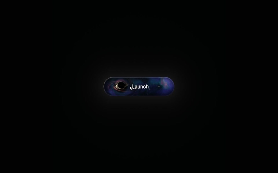
event horizon
A Launch button with a tiny black hole inside: hover bends a glowing nebula and the label around your pointer, and a click swallows Launch in a flash and a shockwave.
see it on uberdesigner -
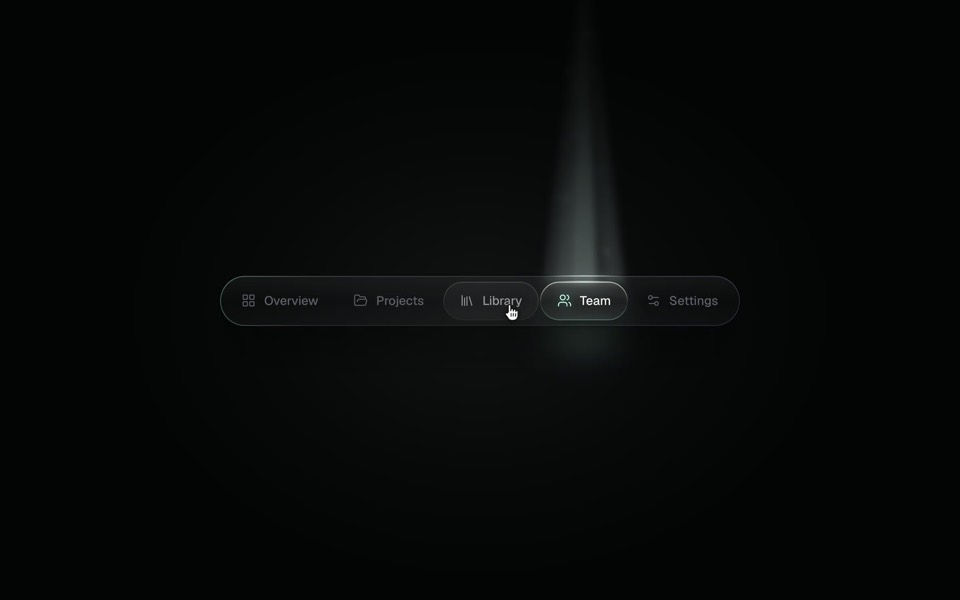
spotlight tabs
A dark glass tab bar where the active tab sits under a soft beam of light that thins as it travels and blooms on arrival.
copy its prompt on uberdesigner
Questions and answers
Can I drop a generated button into my existing project?
Yes, if the prompt names your setup. Tell the tool where components live, how styles are written and which colour and spacing variables exist, and ask it to use those instead of new values.
Is an elaborate button a good idea in a product?
For one moment that matters, such as the main action on a launch page or a payment step. Everyday controls should be quiet and quick. A showpiece button is one piece and should not set the style of every control in the app.
Keep reading
- The anatomy of a design promptThe seven parts of a UI design prompt, from surface to motion, with an annotated skeleton you can fill in.
- How to describe a visual style to an AI toolThe vocabulary a model acts on when building UI (materials, light, density, edges) and the adjectives it ignores, with a style block to copy.
Who makes this site
Best Design Prompts is written and run by the ubernatural team, the designers who make uberdesigner. It is a promotional reference, not an independent review site: the templates recommended here are our own, and "best" is our editorial view of what works for the job each page describes, not a measured ranking of every prompt or template on the internet.
Cite this page: Best Design Prompts, “Button and control prompts”. Reviewed 11 November 2026. https://bestdesignprompts.com/button-and-control-prompts/