prompt topic
Mobile app UI prompts
Answer in brief
A mobile app UI prompt works when it fixes the frame, names the screen's one job and sizes everything for a thumb. Give the canvas as 390 × 844px, keep tappable things at 44px or more, and say what sits in the top and bottom bars.
Say also whether you want the screen alone or shown inside a drawn phone. For a design study, a phone frame on a plain stage reads better on a desktop monitor than a narrow column lost in white space.
Set the frame and the safe areas
Without a size, a tool builds a responsive web page and calls it an app. State the screen size, the space kept clear at the top for the status bar and at the bottom for the home indicator, and the side margin, usually 16 or 20px. Say that the content scrolls between a fixed top bar and a fixed tab bar, if the screen has them.
If the screen is shown in a phone frame, describe the frame simply: a rounded rectangle with a 48px radius and a thin bezel. It should not compete with the screen.
Give the screen one job
A phone screen does one thing: track a delivery, add a task, read a note. Name the job and the one primary action, then put that action where a thumb reaches it, in the lower third. List what else is on the screen in order from top to bottom, with real text.
Phone type is larger than people expect when they write for desktop. A 17px body, a 28 to 34px screen title and 13px captions are a safe scale to state.
Describe touch, not hover
There is no hover on a phone. Say what a tap, a long press and a swipe do, and how a pressed element looks: a scale to 0.97 and a darker fill for 0.1 seconds is a common choice. Describe how a sheet rises from the bottom and how it is dismissed.
If the screen plays itself as a demo, write the script as numbered steps with timings, and keep it short enough to loop cleanly.
What a mobile app UI prompt should contain
- The frame: screen size, safe areas, side margin, and whether a phone is drawn around it.
- The job of the screen and its one primary action.
- The layout, top to bottom, with real text and counts.
- Type scale for phone: title, body, caption.
- Touch behaviour: tap, long press, swipe, pressed state, sheets.
- The stage: how it appears on a desktop screen and on an actual phone.
A prompt to start from
Build one phone screen for [app name], a [what it is]. The screen is "[screen name]" and its one job is [job]. The primary action is "[button label]".

Stack: Vite + React + TypeScript, plain CSS with custom properties. No UI library.

Frame: the screen is 390 × 844px. On desktop, draw it inside a phone: a rounded rectangle with a 52px radius, a 10px bezel in #111, centred on a page background of #f1efe9. On a real phone (viewport under 480px wide), drop the frame and fill the viewport.

Safe areas: 54px clear at the top for a status bar, 34px at the bottom with a 134 × 5px home indicator. Side margin 20px.

Look: screen background #ffffff, text #121212, secondary #7a7a7a, hairlines #ececec, one accent [#hex]. [Typeface]. Screen title 30px/700, body 17px, caption 13px. Cards have a 20px radius and 16px padding.

Layout, top to bottom:
1. Title "[title]" with a 36px round avatar on the right.
2. A summary card, 120px tall: [the main value and one supporting line].
3. A list of [number] rows, 64px each: a 40px icon tile, a title, a caption, a value on the right. Use this content: [real rows].
4. The primary button, fixed 16px above the tab bar: full width, 56px tall, radius 18px, accent fill, white 17px/600 label.
5. A tab bar, 64px: four icons, the active one in the accent with a 4px dot under it.

Touch: rows and the button scale to 0.97 for 0.1s when pressed. Tapping the button raises a sheet from the bottom over 0.35s with cubic-bezier(0.2, 0.9, 0.3, 1); the sheet has a 36px grabber, [its content], and closes on a downward drag or a tap on the dimmed backdrop.

With prefers-reduced-motion, the sheet fades in with no slide.

Run it and check it at 390px wide and at 1440px wide. Tap through the sheet both ways.
Written for this page as a starting point; swap the parts in [brackets] for your own. The full prompt of each uberdesigner template is longer and specific to one finished design, and it is tested by rebuilding the template from the prompt alone.
Phone UI to start from
Finished phone screens on uberdesigner, each shown in a phone and built around one job. Oglet and wagdrop are free.
-
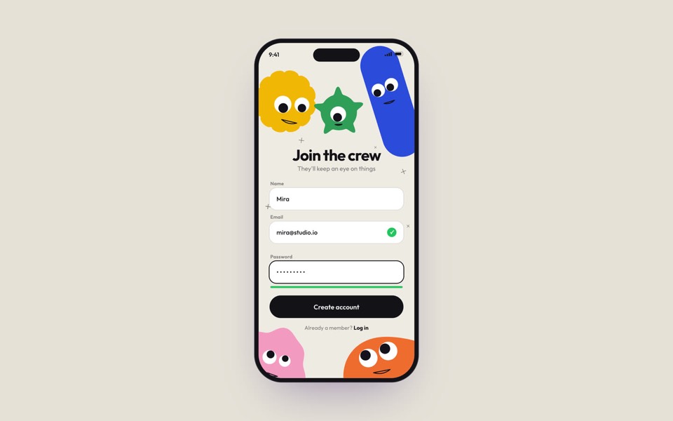
oglet
A phone sign-up screen watched by five googly-eyed characters who follow every tap, flinch at a typo and hop for joy, on an 18-second loop.
copy its prompt on uberdesigner -
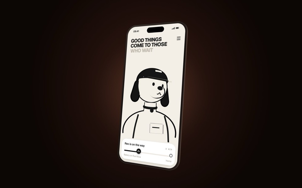
wagdrop
A delivery-tracking screen on a turning phone, starring Rex the courier dog: a 3D toon that reads as a flat line drawing and keeps facing you.
copy its prompt on uberdesigner -
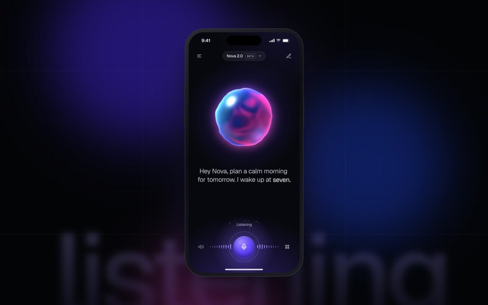
nova
A voice-first AI assistant in a phone: a glass orb listens, thinks and answers in a seamless 15-second loop.
see it on uberdesigner -
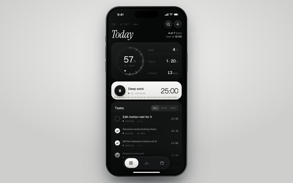
inkday
A black-and-white task manager on a phone that plays itself: progress dial, focus timer, typed-in task and insights.
see it on uberdesigner -
delete to dust
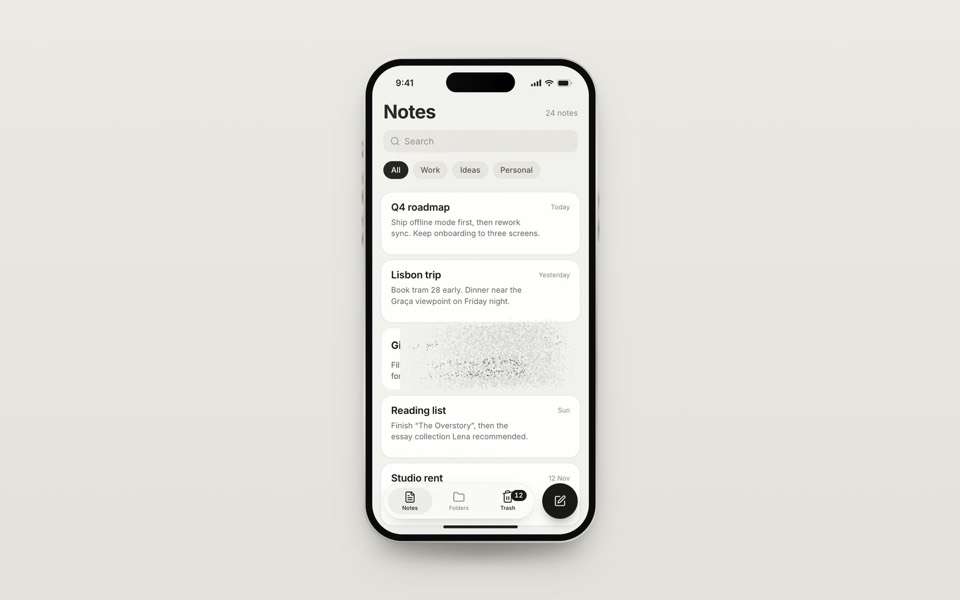
A notes app on a phone where a long-pressed note is deleted into about 10,000 specks of dust that stream into the Trash tab, and Undo pulls them back, on a 10.4-second loop.
see it on uberdesigner -
hand atlas
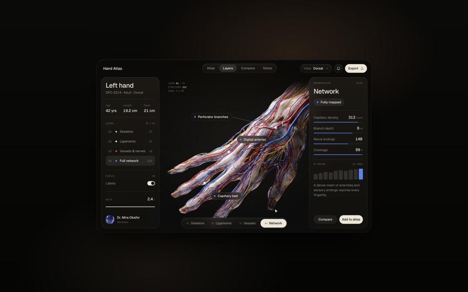
An anatomy app on an 18.2-second loop: a hand builds up layer by layer, skeleton, ligaments, vessels and nerves, then the full network, as a pointer clicks through the layers.
see it on uberdesigner
Questions and answers
Does a prompt like this build a real mobile app?
It builds the screen as a web interface in React. That is enough to design, test and show the UI. Turning it into an installed app is a separate step with its own tools, and the design values carry over.
Should I ask for iOS or Android style?
Only if you need a platform's conventions. Say which and name the parts you want followed, such as the tab bar position or the back gesture. For a product with its own look, describe that look and keep to general touch rules.
Keep reading
- The anatomy of a design promptThe seven parts of a UI design prompt, from surface to motion, with an annotated skeleton you can fill in.
- One look across many screensHow to keep several AI-built screens in one design system: write the tokens once, give them to every prompt, and take the look from a family of pieces, not one.
Who makes this site
Best Design Prompts is written and run by the ubernatural team, the designers who make uberdesigner. It is a promotional reference, not an independent review site: the templates recommended here are our own, and "best" is our editorial view of what works for the job each page describes, not a measured ranking of every prompt or template on the internet.
Cite this page: Best Design Prompts, “Mobile app UI prompts”. Reviewed 11 November 2026. https://bestdesignprompts.com/mobile-app-ui-prompts/