prompt topic
Glass UI prompts
Answer in brief
A glass UI prompt works when it describes two things: what is behind the glass, and how the glass changes it. Glass over a flat colour is a grey box. The look needs a backdrop with colour and movement, a blur amount, a tint, a bright rim and text that stays readable on top.
Name the kind of glass. Frosted glass blurs. Liquid glass bends what is behind it like a lens. Fluted glass breaks it into vertical ribs. Each is built differently, and "glassmorphism" on its own gets the weakest version of the first.
Build the backdrop first
Decide what the glass sits over: a photograph, soft blobs of colour that drift, a shaft of light, the content of the app itself. Describe it with colours and sizes and say how slowly it moves. The backdrop gives the glass something to show, and it sets the mood more than the panel does.
Keep contrast in the backdrop moderate. Very bright and very dark areas side by side make text on the glass hard to read, whatever the blur.
Describe the pane in layers
Frosted glass in CSS is a stack. A backdrop blur, often 16 to 30px, with a little extra saturation. A tint, such as white at 10 to 20 percent on a dark scene. A 1px rim that is brighter at the top than at the bottom, which is what makes an edge read as glass. A soft shadow below to lift the pane. Give a number for each.
Liquid and fluted glass go further: they shift or repeat what is behind them. That usually needs an SVG displacement filter or a small shader. Say which you want, and ask for plain frosted glass as the fallback where the effect is not supported. Check the current browser support for the technique before you depend on it.
Protect the text
Text on glass sits over a moving picture, so it needs help: a slightly stronger tint behind text blocks, a heavier weight than you would use on a solid surface, and no thin grey captions. Ask the tool to check contrast at the lightest and darkest points of the backdrop.
Use glass for a few panes. A card, a bar, a menu. When every surface is glass, nothing is behind anything, and the effect is lost along with the frame rate.
What a glass UI prompt should contain
- The backdrop: what is behind the glass, its colours and how it moves.
- The kind of glass: frosted, liquid or fluted, and how it is built.
- The layers: blur, saturation, tint, rim and shadow, each with a number.
- Legibility: text weight, tint behind text, a contrast check.
- The fallback for browsers without the effect, and for reduced transparency.
- The limit: how many panes are glass, and what stays solid.
A prompt to start from
Build one frosted-glass card for [product] showing [content, e.g. today's sleep summary], over a slowly moving backdrop. A design study on a single page.

Stack: Vite + React + TypeScript, plain CSS with custom properties. No libraries, no WebGL.

Backdrop: full viewport, base #0c0f1a. Three blurred colour fields drift behind the card: #3b5bff at 520px, #ff7a45 at 420px and #19c2a0 at 360px, each a circle with filter: blur(90px) at 70% opacity. They move on slow independent loops of 18s, 23s and 29s, travelling no more than 120px, so the colour under the card keeps changing.

Card: 380 × 460px, centred, radius 32px.
- backdrop-filter: blur(26px) saturate(150%), with the -webkit- prefix as well.
- Tint: rgba(255,255,255,0.10).
- Rim: a 1px inner border drawn as a gradient, rgba(255,255,255,0.55) at the top to rgba(255,255,255,0.08) at the bottom.
- A highlight: a 1px line of rgba(255,255,255,0.7) across the top edge, inset 24px from each side.
- Shadow: 0 30px 60px -20px rgba(0,0,0,0.55).

Content, padding 28px, text #ffffff: a 13px/600 uppercase label "[label]"; a 64px/600 value "[value]" with tabular figures and a 20px unit; a row of seven bars 10px wide for the week, today's bar solid white and the rest at 35% white; two lines of 15px/500 detail. Behind the two lines, a second tint of rgba(0,0,0,0.18) with a 16px radius so they stay readable.

Interaction: the card tilts up to 4 degrees toward the pointer and the top highlight shifts 12px with it, eased over 0.3s. On touch devices, no tilt.

Fallback: where backdrop-filter is unsupported, use a solid rgba(28,32,48,0.92) fill. With prefers-reduced-motion, the colour fields stop and the tilt is off. With prefers-reduced-transparency, use the solid fill.

Phones: the card is the viewport width minus 32px, the same height.

Run it and check that all text passes 4.5:1 contrast when each colour field is behind it, at 390px and 1440px.
Written for this page as a starting point; swap the parts in [brackets] for your own. The full prompt of each uberdesigner template is longer and specific to one finished design, and it is tested by rebuilding the template from the prompt alone.
Glass UI to start from
Finished glass interfaces on uberdesigner: frosted widgets, cards in a beam of light, fluted glass, a lens switch and a glass menu. Five of these are free.
-
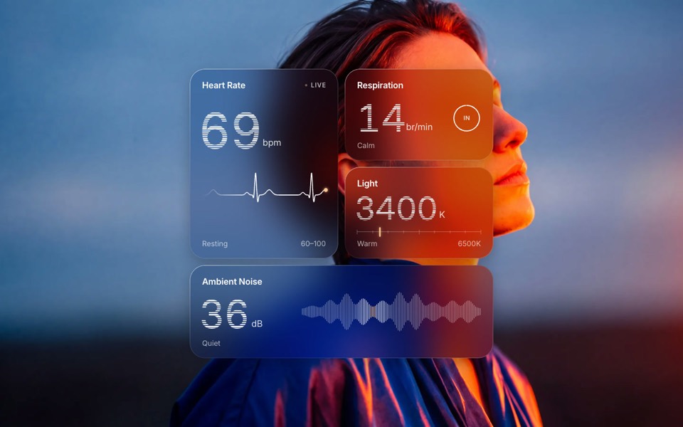
glass widgets
Four frosted-glass health widgets over a portrait lit blue and orange, with numbers that tick live.
copy its prompt on uberdesigner -
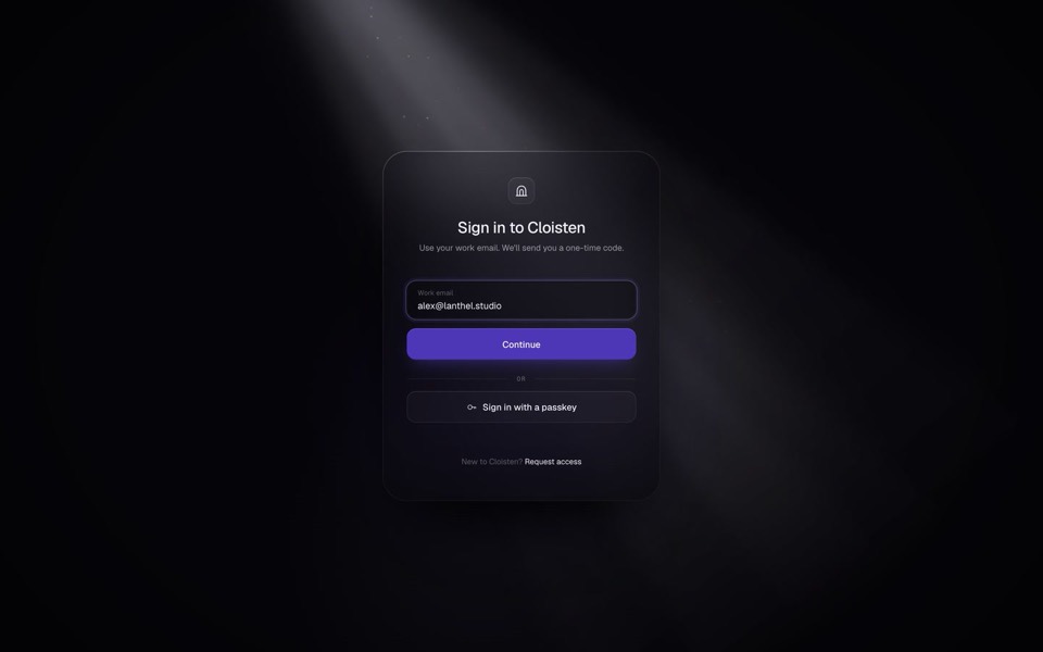
cloisten
A glass sign-in card in a shaft of light: email, one-time code and welcome in a seamless 13-second loop.
see it on uberdesigner -
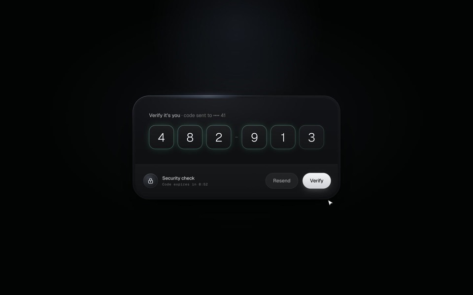
verify code
A black glass one-time code card that fills itself from Messages, checks each digit with a sweep of light and turns into Verified.
copy its prompt on uberdesigner -
beamfall
A glass settlement card with a live chart, held in a beam of light that falls from above and flows on below.
copy its prompt on uberdesigner -
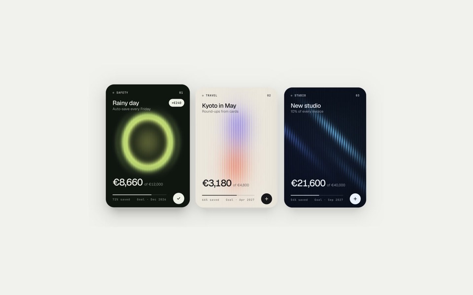
fluted goals
Three savings-goal cards behind ribbed glass: in turn each clears its glass, takes a deposit, counts up and grows its progress bar, on a 12-second loop.
see it on uberdesigner -
lens switch
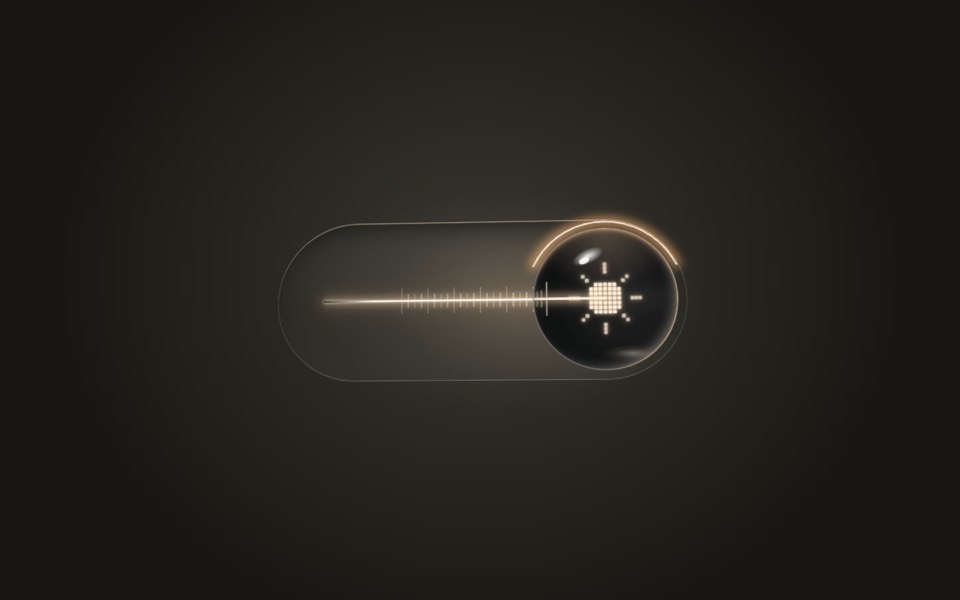
A glass light switch whose sphere knob magnifies like a lens: a pixel moon turns into a pixel sun as a warm filament flickers on.
copy its prompt on uberdesigner -
glass menu
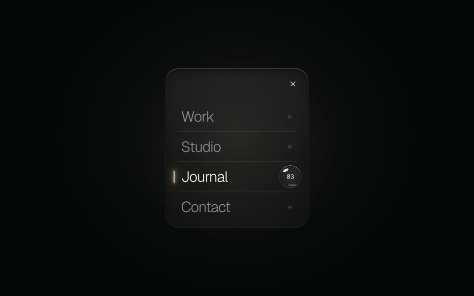
A burger button that grows into a frosted-glass menu, with a small liquid-glass lens that glides to the active item.
copy its prompt on uberdesigner -
brumavel
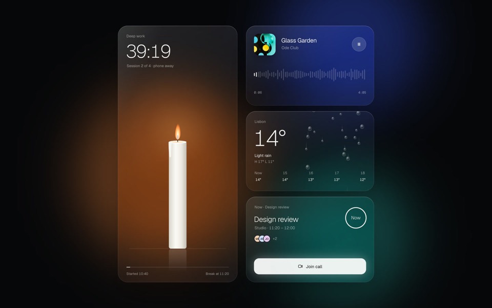
Four frosted-glass widgets over drifting light: a candle timer, now playing, rain and a meeting countdown.
see it on uberdesigner -
hold to pay
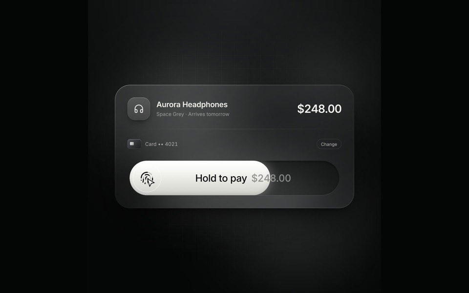
A glass checkout card on an 8.4-second loop: hold the pay button and the fill sweeps across, the button collapses into a spinner and springs back out as Paid.
see it on uberdesigner -
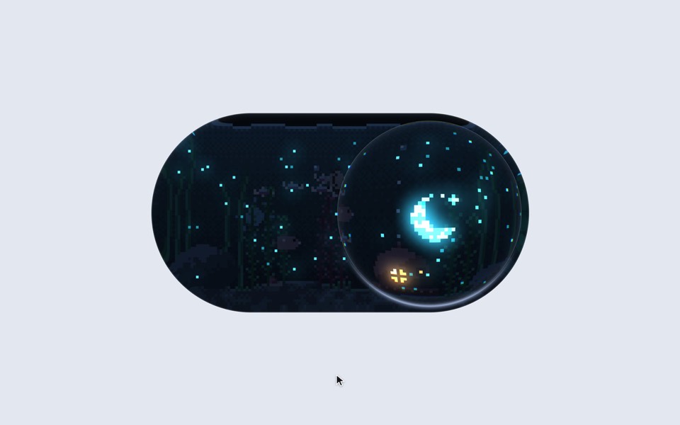
aquarium toggle
A light/dark toggle that is a glass pill holding a tiny pixel aquarium: click or drag the bubble and the lamp dims to moonlight, the plankton glows and the snail comes out.
copy its prompt on uberdesigner

Questions and answers
Is glass UI slow?
Blurring what is behind an element costs more than a flat fill, and the cost grows with the size and number of panes. Keep glass to a few elements, avoid stacking one pane over another, and test on a mid-range phone.
What is the difference between frosted and liquid glass?
Frosted glass blurs what is behind it. Liquid glass refracts it: the backdrop appears bent or magnified near the edges, like a lens. The second needs a displacement filter or a shader, so ask for a frosted fallback.
Keep reading
- How to describe a visual style to an AI toolThe vocabulary a model acts on when building UI (materials, light, density, edges) and the adjectives it ignores, with a style block to copy.
- One look across many screensHow to keep several AI-built screens in one design system: write the tokens once, give them to every prompt, and take the look from a family of pieces, not one.
Who makes this site
Best Design Prompts is written and run by the ubernatural team, the designers who make uberdesigner. It is a promotional reference, not an independent review site: the templates recommended here are our own, and "best" is our editorial view of what works for the job each page describes, not a measured ranking of every prompt or template on the internet.
Cite this page: Best Design Prompts, “Glass UI prompts”. Reviewed 11 November 2026. https://bestdesignprompts.com/glass-ui-prompts/